


US vs. Japan: Console Logo Design Trends
Gaming console logos tell a story of design philosophies shaped by regional preferences. Japanese logos often focus on artistic detail and cultural elements, while US logos prioritize bold, straightforward designs for universal appeal. These differences reflect how each market connects with gamers, influencing purchases and brand loyalty.
Key Insights:
- Japanese Logos: Subtle designs, soft color palettes, and references to local traditions (e.g., Nintendo's early logos with Japanese characters).
- US Logos: Bold, high-contrast styles, emphasizing clarity and hardware specs (e.g., Sega Genesis' sharp metallic look).
- Nintendo Example: The Super Famicom's colorful button-inspired logo contrasts with the US SNES' italicized, functional design.
- Sony PlayStation: Maintained consistent branding globally, with minor regional variations like the Spider-Man font experiment during the PS3 era.
- Retro Appeal: Classic logos, like the N64's 3D "N", remain iconic, resonating with collectors and fans worldwide.
Gaming logos are more than just visuals - they’re symbols of eras, markets, and identities. Whether through sleek artistry or bold simplicity, these designs continue to shape how gamers perceive and connect with their favorite brands.
Logo History #47: Nintendo/Sega/Xbox/Playstation Consoles
sbb-itb-9a4764e
US and Japanese Design Approaches
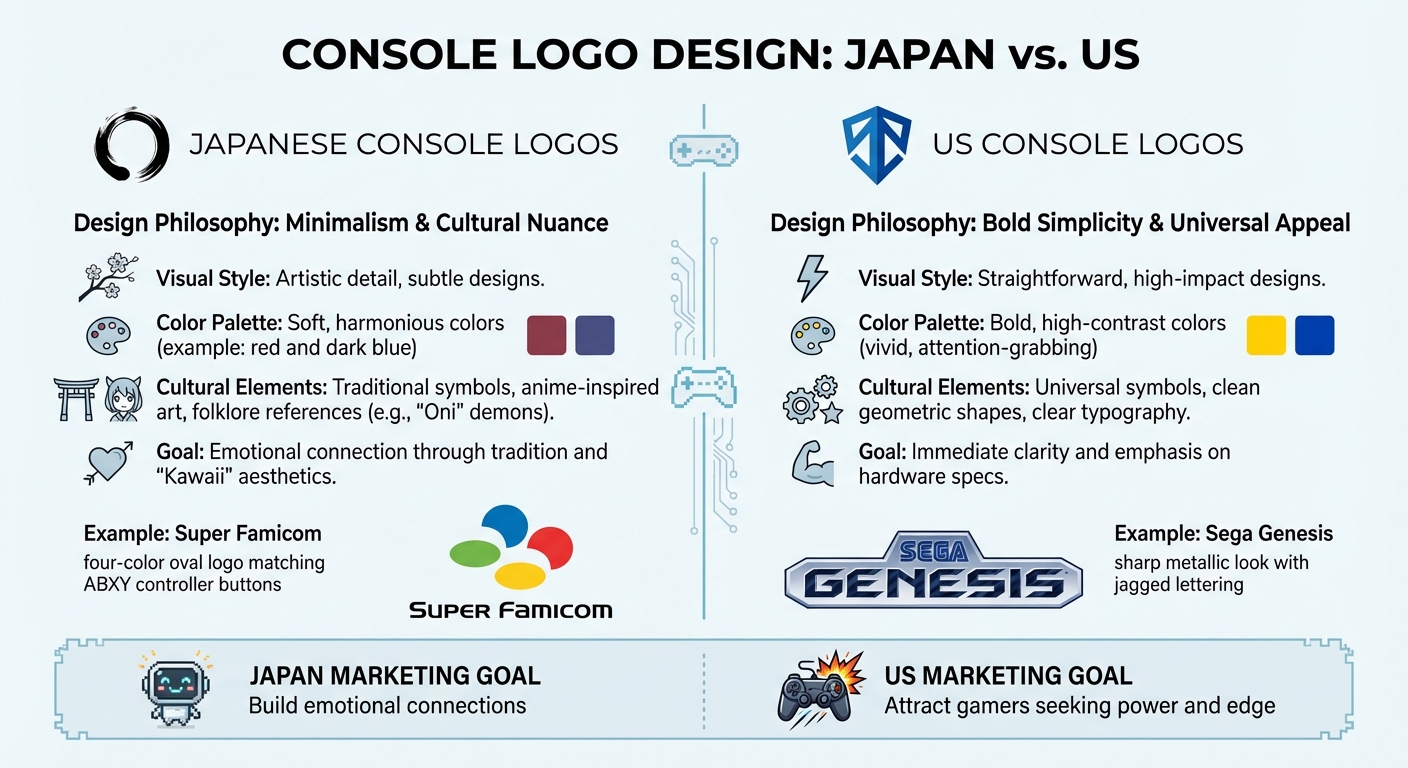
US vs Japan Console Logo Design Philosophy Comparison
Simple Designs vs. Strong Visual Impact
The key difference between US and Japanese console logo design lies in their contrasting philosophies. Japanese logos focus on minimalism and subtle cultural nuances. Take Nintendo's 1889 logo, for example - it featured a red top paired with dark blue Japanese characters, reflecting a dedication to refined and understated design traditions. This approach conveys a sense of elegance and connection to cultural roots.
In contrast, American console branding leans toward straightforward visuals. US publishers believed that designs with immediate clarity would resonate better with American gamers. This difference extends to cover art as well - US designs often opt for simple, restrained visuals, while Japanese editions embrace dynamic and detailed artistry.
Cultural Symbols in Logo Design
Japanese logos often incorporate elements tied to local traditions and values. For instance, the dark blue Japanese lettering in early Nintendo branding established a consistent design language that reinforced cultural identity. Anime-inspired art and folklore references, such as "Oni" (demons) in game titles, also highlight how Japanese design integrates regional symbolism to create a sense of uniqueness.
On the other hand, US logos avoid relying on culturally specific symbols. Instead, American branding focuses on universal appeal by using simple and globally recognizable design elements. This includes clean geometric shapes, clear typography, and icons that are easy to understand across different markets. The goal is to craft designs that resonate broadly rather than tie them to a particular cultural context.
Color Choices in Console Logos
Color choices further illustrate the divide between these design philosophies. Japanese logos often feature softer, harmonious palettes that align with aesthetic traditions. A classic example is the red and dark blue combination in early Nintendo logos, which exudes balance and understated sophistication.
American logos, by contrast, favor bold and high-contrast colors designed to grab attention, especially in retail settings. The Super Scope is a great example: while the Japanese version used true gray, the US version employed smokey blue hues for a more striking look. Similarly, US SNES covers frequently used vivid, bold colors to stand out, in sharp contrast to the more subdued tones of their Japanese counterparts. These distinct approaches to color set the stage for how console branding evolved in later years.
How Console Logos Changed Over Time
Console logos have undergone noticeable transformations, often reflecting regional design philosophies and market strategies.
Nintendo: Famicom to Switch Logo Changes
Nintendo's logo history highlights how the company tailored its branding for different audiences. Back in the 1980s, the Japanese Famicom (short for "Family Computer") featured a design that emphasized its appeal as a household-friendly device. Meanwhile, in the US, the Nintendo Entertainment System (NES) adopted a more neutral and restrained logo. This approach was deliberate - after the 1983 video game market crash, Nintendo aimed to rebuild consumer trust with a no-frills image.
As gaming advanced, the design differences between regions became even more apparent. The Japanese Super Famicom logo introduced a sleek design with four colorful dots representing the ABXY buttons on the controller. On the other hand, the US Super Nintendo (SNES) logo leaned on italicized text with red and purple tones, set against a striped background. Critics often found this design less appealing. By the mid-1990s, Nintendo showcased the power of the Nintendo 64 with a 3D "N" cube, cleverly designed with 64 sides to highlight its technical capabilities. Moving into the modern era, Nintendo shifted its corporate wordmark to a grey logo from 2006 to 2016 but returned to its iconic red branding with the launch of the Switch.
Sega: Genesis vs. Mega Drive Branding
Sega's approach to branding during the 16-bit era reflected bold regional differences. The US Genesis logo embraced a sharp, metallic look with jagged lettering, aiming to capture the edgy, rebellious vibe of the 1990s. This was a calculated move to attract gamers looking for an alternative to Nintendo's family-friendly branding. In contrast, the Japanese Mega Drive logo took a more understated, tech-focused route, prioritizing simplicity over theatrics.
This shift was a reaction to the Master System logo, which many felt lacked personality and closely resembled the NES. Sega's rebranding with the Genesis was a clear attempt to stand out and cement its identity in the competitive gaming market.
PlayStation: One Logo, Regional Variations
Unlike Nintendo and Sega, Sony opted for a unified brand identity across regions. The original 1995 PlayStation logo, created by Manabu Sakamoto, featured an isometric "S" in vivid red, yellow, green, and blue. This design quickly became iconic worldwide. To celebrate its 20th anniversary, Sony even released a limited batch of 12,300 PlayStation 4 consoles featuring this original multicolor logo.
Sony did briefly experiment during the PlayStation 3 era when then-president Ken Kutaragi pushed for the console to adopt the font used in Sony's Spider-Man films. This marked a departure from the familiar branding. However, the company soon reverted to its established angular PS2-style shorthand with the PS3 Slim, PS4, and PS5. As VG247 observed:
"Sony's conservative design choice does give us one vital takeaway. No matter how different the PlayStation 5 ends being from its predecessors, Sony's vision for the console evidently hasn't forced a major reconsideration of its brand".
This consistency has been a cornerstone of Sony's strategy, allowing the company to maintain its brand identity across different regions while staying true to its loyal fanbase. Balancing familiarity with subtle innovation has helped Sony avoid alienating players in both the US and Japan.
How Logo Design Affects Marketing
Logo design plays a crucial role in shaping how consumers view a brand, fostering loyalty, and influencing purchasing decisions.
Designing Logos for Different Audiences
Gaming companies have long recognized that audiences in the US and Japan respond to distinct design elements. As Joseph Parziale from GoCollect put it:
"Companies knew that each audience was very different in what appealed to them, and would tweak cover art accordingly to increase sales for that region".
This principle extends beyond game covers to console logos, where cultural preferences drive design choices.
Take the Sega Genesis, for example. Its sharp, jagged lettering and metallic plaque gave off an "edgy" vibe that appealed to US gamers looking for something more mature compared to Nintendo's family-friendly branding. On the other hand, Japanese designs often embrace "Kawaii" aesthetics - playful and cute elements, with softer colors and character-driven artwork that create emotional resonance. This cultural divide was also evident during the 1990s "bits war", as US logos like the TurboGrafx-16 and Nintendo 64 emphasized hardware specs (e.g., "16" and "64") to highlight processing power.
| Market | Design Approach | Marketing Goal | Example |
|---|---|---|---|
| US | Bold, aggressive, spec-focused | Attract gamers seeking power and edge | Genesis metallic logo with jagged text |
| Japan | Artistic, symbolic, playful | Build emotional connections through tradition and "Kawaii" | Super Famicom's four-color oval matching controller buttons |
These targeted strategies demonstrate how retro console logos continue to evoke deep emotional connections with gamers.
Using Retro Logos to Connect with Gamers
Retro console logos are more than just nostalgic designs - they are powerful tools for maintaining brand loyalty. Companies like Sony understand this well, as shown by their consistent logo style from the PS2 to the PS5. This approach ensures they don’t alienate longtime fans.
Sony further capitalized on nostalgia in late 2014 by releasing a limited-edition PlayStation 4 to celebrate its 20th anniversary. Only 12,300 units were produced globally, each featuring the original 1994 four-color logo by Manabu Sakamoto instead of the modern monochrome version. This move tapped into fans’ love for the brand’s heritage, combining scarcity and nostalgia to appeal to collectors.
Retro logos also serve as markers of authenticity. As Jonathan Lam from Envato explains:
"Video game console logos are so much more than just a company name slapped on a box - these are carefully crafted symbols representing entire gaming eras".
The enduring appeal of the Atari "Fuji" logo is a prime example. Decades after its peak, it remains a celebrated symbol of gaming history. Similarly, the Nintendo 64 logo, designed with 64 distinct sides to highlight its 3D capabilities, has become an emblem of both nostalgia and technical innovation. As noted by logotype.dev:
"The N64 logo is a symbol of nostalgia, innovation, and the enduring love for classic gaming".
Case Study: Retro Gaming Collectors
Retro logos continue to resonate with collectors, reinforcing brand heritage and authenticity. Retailers like BJ's Game Vault (https://bjsgamevault.com) use classic designs to connect with enthusiasts who value the nostalgia and history of gaming. Specializing in rare ROM hacks, custom cartridges, and reproduction vs. original vintage titles for systems like NES, SNES, Sega Genesis, N64, and GBA, the store appeals to those who grew up with these consoles.
Western gamers, in particular, have shown growing interest in Japanese "Complete in Box" (CIB) games. These versions often feature superior artwork compared to the censored or simplified Western releases, making them highly collectible and more expensive. By offering custom game creation services and retro-tested items, BJ's Game Vault positions itself as a curator of gaming history, using familiar logos and aesthetics to emphasize its dedication to preserving classic gaming culture.
Content creators and retailers also incorporate retro logos in videos and social media to establish credibility and foster a sense of community among gaming enthusiasts.
Conclusion: What We Learn from US and Japanese Logo Design
Appreciating Different Design Styles
The differences between American and Japanese console logo designs highlight how culture influences branding. In the US, logos often focused on technical features and boldness, while Japanese designs leaned toward artistic flair and emotional resonance. A great example is the Super Famicom's four-color oval logo, which mirrored the ABXY button colors on its controller, creating a unified aesthetic. In contrast, the US SNES logo featured italicized text and a striped background, emphasizing a more straightforward and functional appeal.
Both styles were successful in connecting with their target audiences. In the US, logos helped restore consumer trust after the 1983 video game crash by emphasizing strength and value. On the other hand, Japanese designs celebrated gaming's creativity and cultural depth with sleek visuals and meaningful symbols. These differences not only reflect unique cultural perspectives but also contribute to the enduring legacy of these brands in gaming history.
Keeping Classic Gaming Logos Alive
Preserving classic gaming logos is about more than nostalgia - it's about honoring the heritage and artistry behind each brand. These logos are gateways to gaming history, celebrating the contributions of artists like Yoshitaka Amano and Akira Toriyama, whose original visions were sometimes modified for Western audiences.
Collectors especially value these original designs. Japanese "Complete in Box" games often fetch higher prices because they maintain the original artwork and design elements, free from alterations or censorship. Platforms like BJ's Game Vault (https://bjsgamevault.com) play a vital role in keeping this history alive. They offer rare fan-made ROM hacks, custom cartridges, and reproduction vintage titles for systems like NES, SNES, Sega Genesis, N64, and GBA. By providing retro-tested items and custom game creation services, they ensure that both US and Japanese design traditions continue to inspire gamers who value authentic gaming experiences and the stories behind them.
FAQs
Why do US console logos focus so much on power and specs?
US console logos tend to focus on showcasing power and advanced specifications, aiming to underline performance and cutting-edge technology. These logos often feature bold and dynamic designs, emphasizing strength and progressiveness. This approach aligns with the preferences of consumers looking for immersive, high-performance gaming experiences, where superior graphics and gameplay take center stage.
In contrast, Japanese console logos lean toward minimalist designs and often include cultural influences. This reflects a different set of branding priorities, focusing on simplicity and subtlety rather than raw power. These distinct styles highlight the varying approaches to appealing to gamers across different markets.
What cultural cues are most common in Japanese console logos?
Japanese console logos tend to focus on simple, letter-based designs that showcase a clean and modern look. This style mirrors values such as simplicity, balance, and subtle elegance. Take Nintendo's logo, for example - it features a straightforward typographic design that perfectly complements Japan's emphasis on clear and polished branding.
How do retro logos affect collectors and resale value?
Retro logos hold a special place in the hearts of collectors and can significantly influence resale value. These designs tap into nostalgia and embody key moments in gaming history. Logos from legendary consoles like the Atari 2600 or NES often transform into prized collectibles, particularly when found on original packaging or exclusive merchandise.
What makes these logos so appealing? Their distinct aesthetics - featuring bold colors, striking typography, and memorable visual elements - capture the essence of their time. This combination of authenticity and rarity not only boosts demand but also elevates their resale value. Beyond their monetary worth, these logos stand as visual markers of gaming's evolution, preserving its rich legacy for future generations.